Type Foundry & Design Studio offering retail and custom typefaces. Contemporary aesthetic 🤝 Swiss tradition 📍Lucerne & NYC
Lucerne, Switzerland
Joined December 2009
- Tweets14.4K
- Following788
- Followers24.3K
- Likes10.2K


Pinned Tweet
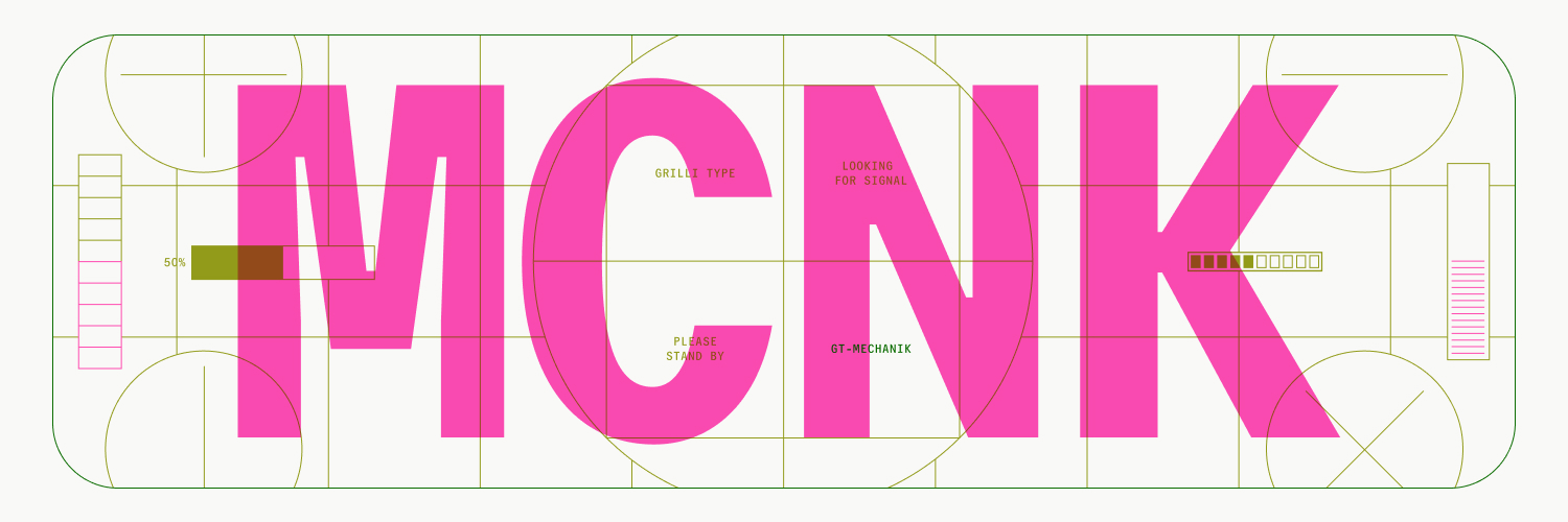
◾GT Mechanik is the message ◾
Built on a monospaced foundation with rhythmic spacing, our newest typeface invites designers to find the tone that suits their message.
◾ Visit → gt-mechanik.com
Designed by Noël Leu, Reto Moser, @shiva__n
◻Out Now◻
#GrilliType


GT Maru + GT Alpina → Edition Moderne, a renowned graphic novel publishing house.
Designing almost all of its books in-house, Edition Moderne has used Grilli Type fonts to match its program, featuring classic and avant-garde works.


For really fun reasons our website is offline right now. Sorry! Email us at mail at grillitype if you’re in urgent need of fonts
Did you know GT Maru has an emoji font?
Letters are only half of the typeface family. Choose full color or black and white, with 400+ of the cutest emojis ready to use.
#GrilliType #GTMaru


Any size, any space: GT Ultra is made for all.
Its typographic system combines the centuries-old tradition of serif type with the dynamism of modern sans.
Test GT Ultra now by downloading our Trial Package → grillitype.com/typeface/gt-u…

Our monthly roundup of fonts in use is here! Visit our blog to see our typefaces in the wild. grillitype.com/blog?utm_sour…


A linear time 🕧
Here's Lorenzo, laser-focused on shaping GT Linear, one afternoon last week.
GT Linear is coming soon, in a straight line.
#GrilliType #GTLinear


GT Pressura → You Can Now, a new magazine designed to reframe what leadership looks like today.
Designed by Alex Hunting Studio, the mag's brief called for a publication that felt both editorially rigorous and visually expressive.


Hello, is anybody there?
GT Mechanik Mono's highly mechanical rhythm is the inevitable outcome of spatial limitation as a guiding principle.


Mono is the basis of the whole GT Mechanik design: its inktraps and idiosyncratic details lend a straightforward naïveté to the Poly and Semi tones.

GT Planar → Concert and Theatre St. Gallen
The 2026/27 season identity was designed by @burosequenz . GT Planar was chosen as the main typeface for its 30° slant, which picks up on the diagonals from the brutalist Paillard building.


