

A Fresh Perspective on Your Customer Journey Through Lean Design & Dev. Trusted by 12,000+ brands like Loop, Huel, Corkcicle, & Dr. Squatch. Try Oddit FREE ⬇️
Joined January 2021
- Tweets4.9K
- Following401
- Followers12.9K
- Likes3.7K






Pinned Tweet
One question we get asked a lot by new customers (rightfully so) – "What can we expect the results to be?"
As a design-focused company, it's always hard to track results, because its up to our customers if they want to share data with us. We have amazing relationships with our clients, even though for many of them the project ends with their report being delivered.
One of the primary goals of the refresh we've been going through is to be more vocal about our successes, and our customers. While we'll never be able to promise specific results, we consistently see the value of a fresh perspective regardless of what you're selling.
Here's a quick look at how Inspired Go paid back their Oddit within 12hrs of implementing it.

Don't Make Shoppers Scroll to Buy
A product page should make buying easy, not feel like a scavenger hunt.
- Long descriptions.
- Too many details upfront.
- No clear price.
- No obvious buying action.
If shoppers have to work too hard to find what they need, they might leave.
What's the biggest reason you've bounced from an online store?

1
2
419
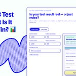
Your A/B Test Won. But Is It a Real Win? 📊
Before rolling out a winning variation, make sure the results aren't just random noise.
Our free A/B Test Significance Calculator helps you:
1️⃣ Check statistical significance.
2️⃣ Measure conversion lift.
3️⃣ Find out how much traffic your test needs.
Less guessing. Better testing decisions.
Try the free calculator: oddit.co/pages/a-b-test-sign…

2
315

Make Bundle Savings Hard to Miss
The “after” version makes it easier to see the value of each bundle.
Discounts are highlighted upfront.
Original prices show the savings.
Product details make comparison easier.
Clear Add to Cart buttons simplify buying.
Specific savings make bundle offers easier to understand and more compelling to shop.

3
4
460
Beauty claims need proof shoppers can actually understand.
This section does that well:
Clear result stats.
Before/after visuals.
Study context.
Specific timeline.
CTA to see more results.
Risk reversal near the proof.
It doesn’t just say “it works.”
It shows why shoppers should believe it.

2
457
Let Shoppers Find Reviews That Matter
Not every shopper is looking for the same proof.
This review section makes it easier to find relevant feedback.
⭐ Filter by performance, ease of use, or durability.
⭐ Verified customer reviews build trust.
⭐ Product links connect feedback directly to shopping.
Less searching. More confidence before buying.

405

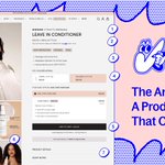
7/8 — Product Gallery
Product images should help shoppers understand what they're buying.
OUAI mixes lifestyle photography with benefit-focused visuals and different hair types.
Each image adds context beyond the product bottle.
1
118
8/8 — Product Details
Not every shopper is ready to buy right away.
OUAI keeps product details and scent notes available for anyone who wants to learn more.
Give shoppers the information they need without overwhelming the buy box.
Want to improve your PDP?
Explore Oddit: oddit.co/

117
The 3 Numbers Every Founder Should Know Before Black Friday
Before you spend more on traffic, check these 3 numbers:
Conversion Rate — How many visitors become customers?
Add-to-Cart Rate — How many shoppers show buying intent?
Average Order Value — How much does each order bring in?
Small improvements can make a big difference in revenue, even with the same traffic.
See what a higher conversion rate could mean for your store with our free calculator.
🔗 oddit.co/pages/conversion-ra…

1
308
Your hero section has 5 seconds to make an impression.
But too many brands waste that time with vague headlines, buried proof, and CTAs that don't tell shoppers what to do next.
Three simple fixes:
→ Lead with a clear benefit. Make the value obvious.
→ Show proof early. Give shoppers a reason to trust you.
→ Make the next step clear. One primary CTA. No guessing.
Your hero shouldn't just look good. It should help shoppers understand why they should buy.
Want to know what's holding your homepage back?
Get a teardown from Oddit. oddit.co/products/page-teard…

3
459

6/7 — Buried Reviews
Don't make shoppers scroll forever to find customer feedback.
Show ratings near product titles.
Bring relevant reviews closer to the buy box.
Proof works best where decisions happen.
1
100
7/7 — Missing Mobile Sticky CTA
Mobile shoppers shouldn't have to scroll back up just to buy.
Keep the Add to Cart button within reach.
Small UX improvements can remove friction before checkout.
Black Friday traffic is coming.
Find the leaks before shoppers do.
Get your site ready for BFCM. oddit.co/
105