

Graphic Designer Contact: [email protected]
UK
Joined October 2019
- Tweets132
- Following0
- Followers8
- Likes1


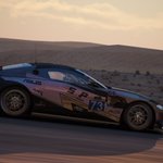
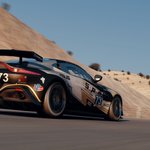



BONUS CAR
An additional car has been added to the fleet.
Dedicated to a personal friend, this particular skin took the longest amount of time out of the set, however I feel that it came out rather well.

It also adds the fun element of working with complex artworks in my pieces, designing around Elrontur's character illustration. Perhaps in future I should experiment and expand upon this, making illustrations a more integral part of the overall design.


1


The main focus was to acknowledge the nature of Will's passing, but still keep the heart of racing alive. This is why I decided to keep the livery dressed with striking decals and race sponsors to maintain the racecar apparel among the rest of the field.

1

Car seven plays a little more into the theme of the set's overall context of being a race series set in the US (bar Mosport in Canada). Draped in red, white, and blue, I aimed to Americanise this project to its fullest extent.


Sixth in the lineup takes a similar appraoch to the ZONE OUT team branding in terms of creative objective, aiming to explore more colour palettes and logo forms.


Livery Five in the set is a little special given the recent happenings in sim racing.
This skin pays homage to SimRacing604, with respect for him and his efforts in exposing shady businesses practices within sim racing modding.


Number Four in the lineup is another original team.
Plenty of external inspiration pushed me into testing the waters of some of these visual features.


Perhaps it may be thought of as being lazy of me to practically copy the album art's ruleset for my own logo, but I wanted to fully grasp the use of alternating stroke weights, combining rounded and sharp corners in one shape, and manipulating letterforms to better suit overall.
1