

We're committed to recognising excellence in design, providing a source of inspiration & connecting the packaging design community. 2026 Winners & more ⬇️
Worldwide
Joined December 2009
- Tweets4.9K
- Following1.7K
- Followers3.9K
- Likes2.2K




Gamze Binici’s #packagingdesign for The Orchard Fox is a playful reinterpretation of the traditional cider brand. Bold typography brings a sense of heritage and craft, while the mischievous fox gives the brand a memorable personality. #DailyDesignInspiration


Tavern’s #packagingdesign concept for Cannes Royale - Cocktails in a Cannes. Inspired by the Kir Royale, combining Champagne with distinctly French flavours from across the country. The packaging inspired by the French Riviera, with a 1960s/70s flare. #DailyDesignInspiration


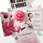
Twelve’s #packagingdesign for Kiehl’s 1cc Collashot mailer. A playful influencer mailer built around the idea of a “collagen shot”, with bold typography, tactile pink and a pop-up reveal that makes the unboxing feel like a plumping treatment in itself. #DailyDesignInspiration


Pantone x Workman Publishing’s holiday gifting #packagingdesign. A celebration of colour, the collection pairs bold hues with iconic Pantone-inspired details. Instantly recognisable, the packaging transforms a range of gifts into joyful objects. #DailyDesignInspiration


All Purpose’s #packagingdesign for Two Tribes. A bold packaging combining brushed silver aluminium with high-impact colour blocks. Each variant features the brand logo, expressive custom typography and a coloured label, creating an energetic range. #DailyDesignInspiration


Agência BUD’s #packagingdesign for Paulista adapts the brand across different formats while keeping a strong, consistent visual language. Clear hierarchy, colour and typography bring the family together while giving each product its own distinction. #DailyDesignInspiration


Voice design’s #packagingdesign concept for Corretto Nero. Created for Make A Mark and inspired by the moka pot, Corretto Nero brings Italian espresso culture to life through a bold, tactile liqueur packaging design. #DailyDesignInspiration


L'Alchimiste Agence’ #packagingdesign for LE CAP. A perforated deep green sleeve wraps the jar, with die-cut windows revealing the product inside. Inspired by the harvest crate, the design brings a tactile, rustic feel to the pack. #DailyDesignInspiration


Vantablack Studio®’s #packagingdesign for Litoral Lab moves away from the medical cannabis category’s usual visual clichés, using a refined distinctive identity to create a more recognisable and consistent brand. #DailyDesignInspiration


Casa Rex’s #packagingdesign for tolc. For tolc, colourful dots and hand-drawn speech bubbles create a distinctive visual language, while playing on the sound of “talk” to bring the brand to life. #DailyDesignInspiration


Glasfurd & Walker’s #packagingdesign for ENSŌ granola, inspired by the Japanese enso, a symbol of freedom. The packaging translates this philosophy into imperfect forms, creating a distinctive identity that feels handcrafted and contemporary. #DailyDesignInspiration


Young Jerks’ #packagingdesign for CRYSTAL VISION pairs vintage-inspired typography with vibrant red and yellow tones, creating a distinctive label that blends nostalgic charm with a playful, contemporary feel. #DailyDesignInspiration


Pixelarte® Studio’s #packagingdesign for Starcrafter. Inspired by the energy and movement of an explosion, the packaging uses dynamic bursts of colour and graphic particles to capture the power and excitement of pyrotechnics. #DailyDesignInspiration


Oveja&Remi’s #packagingdesign for Ravera Wines. A bold, vintage-inspired label with a playful, irreverent character. The vivid palette, oversized typography and expressive illustration create a distinctive, theatrical look. #DailyDesignInspiration


Colony’s #packagingdesign for Loonen water puts the product and its proof front and center, whilst the identity uses warmth, colour, and character to feel trustworthy without being clinical. #DailyDesignInspiration


Established’s #packagingdesign for beecee. A clean, contemporary packaging where soft powder blue meets bold red and glossy cobalt accents. Rounded forms and minimal typography give the packaging a playful yet polished feel. #DailyDesignInspiration


MABA’s #packagingdesign for Naked Wine becomes bare skin: transparent, exposed and covered in tiny tattoos to reveal a luminous, transparent wine that, paradoxically, comes from a red grape that has been stripped of its skin. #DailyDesignInspiration


Planet People Studio’s #packagingdesign for SuetCo. A Western-inspired identity centred around a cow playing guitar. Bold typography and vibrant colours give the character a strong presence, while Western cues draw from Californian ranch aesthetic. #DailyDesignInspiration


Hono Studio’s #packagingdesign for Temper, a cider collection that transforms the 2008 Wimbledon final into 60 unique labels. Risograph-printed in green and purple tones, the frames allow the entire point to replay when the bottles are lined up. #DailyDesignInspiration


MHTL’s #packagingdesign for 7-Eleven Korea. A modular graphic system around the iconic 7. Moving beyond a fixed logo, the identity expands across physical and digital touchpoints, creating a dynamic brand experience shaped around everyday life. #DailyDesignInspiration


