

The data behind the news. https://xitter.cf/t.co/1DggNFASol
Brooklyn, NY
Joined January 2024
- Tweets488
- Following2
- Followers183
- Likes14




Realtime retweeted

@RealtimeDotOrg - quite interesting "news in data stories" site, tracking key numbers across public opinion, environment and er, chess. Then using AI to distill trends into bite-sized stories. Mostly US data. (realtime.org)

Realtime retweeted

let us know what you'd like to see on @RealtimeDotOrg. if "more data," what'd be helpful?

Realtime retweeted

aircraft manufacturer stocks over the past month
Airbus +15.1%
Embraer +34.1%
Boeing -11.8%

ALT image of airbus stock price over a month. it is +1.6% on the day, +4.6% on the week, +15.1% on the month, +37.7% on the year.

ALT image of embraer stock price over a month. it is +8.3% on the day, +17.8% on the week, +34.1% on the month, +61.6% on the year.

ALT image of boeing stock price over a month. it is +0.9% on the day, -1.3% on the week, -10.8% on the month, -11.9% on the year.

Realtime retweeted

NEW on our website
"AI journalism goes awry when it's unchecked, lazy, selfish and opaque. It's got to be vetted and motivated by what's best for readers"
@nytimes new #AI newsroom leader @zseward on what this tech can do for journalism
Click to read
reutersinstitute.politics.ox…

Realtime retweeted
New article for the Generative AI in the Newsroom blog:
Ten lessons that we learned about LLMs while building @RealtimeDotOrg

Realtime retweeted

New on the GAIN blog we have @mathisonian describing how they use LLMs to automatically describe charts of public data streams that are published on @RealtimeDotOrg - generative-ai-newsroom.com/w…

Realtime retweeted
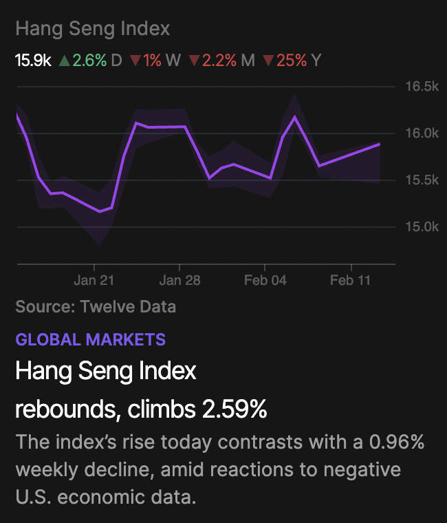
Designing data visualizations that work across data from different domains is difficult.
Here's one challenge we're facing in designing @RealtimeDotOrg:
We use the common green/red color scheme to indicate % changes up/down (plus ▲ icons to help in cases where people can't distinguish the colors). We like this because many people are familiar with this use of color.
But it looks funny in cases where the data going down is a good thing (e.g. air quality index).
How would you solve?
- ditch green/red for colors without the semantic implications
- keep the colors but invert the data's scale so up is good
- keep green/red+scales and just accept the awkwardness

Realtime retweeted
excited to announce the launch of a project @mathisonian and i have been working on: Realtime. check it out. a good place to start is realtime.org/about, which lays out how it works and the role we envision for it in the broader media ecosystem.

Realtime retweeted

I was lucky and got to play with early versions of @RealtimeDotOrg - extremely fun and impactful project.
So nice to quickly pull up data everyone knows and talks about but is super annoying to find and show.

Happy to share what I've been quietly working on with @harshwords222 over the last months.
Realtime is an automated tool to help us track and understand public data as it changes over time. We're opening up the beta today for anyone to try out.
xitter.cf/RealtimeDotOrg/status/…