

I specialize in assisting DTC brands with designing high-converting, scalable landing pages. Figma || Replo || shopify https://nitter.gq/t.co/bBLjqhqjvF
Joined November 2025
- Tweets535
- Following2K
- Followers198
- Likes7.2K




Pinned Tweet
I usually spend more time thinking about the first few seconds than anything else.
If the opening doesn’t give you a reason to stay, the rest of the ad won’t matter.
Working on the first thing visitors see when they land on a store.
I wanted the product to take the lead while the text and layout supported it.


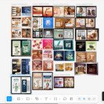
A collection of ecommerce creatives I've been working on.
Different products, different brands, each with its own visual direction.
Always fun finding the right way to make a product stand out.

Tomiwa Elizabeth retweeted

Scaling Direct Response offers? We shipped Tagada V3 fully AI native.
-> Tagada.io
You prompt, it builds: landing, checkout, upsells, subs, AB tests, VIP club, email flows…
Best checkout & CRM on the market, multi-acquirer processing & card vaulting included.
Straight sales or MRR, it handles both.
Try it now. $500 credit on us.
Shopping online should feel like walking into a store where everything is easy to find.
You shouldn't have to dig through five sections just to understand a product or figure out how to buy it.

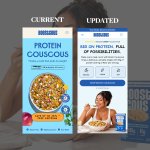
Looking at the original page, I could see there was room to make things clearer.
I wanted the content to breathe, the product to get more attention, and the overall experience to feel easier to follow.
Here's the result.

Some products don’t need a long explanation.
They need an ad that makes people stop scrolling and pay attention.
That’s what I focused on with this one, making the product stand out and giving the message room to do its job.

I didn’t want to change things just to make the page look different.
I wanted the product to be easier to notice, the content easier to follow, and the overall layout to feel more intentional.
Here’s the result.

Build this mobile view in Instant, ensuring the design is clean, responsive, and consistent with the intended layout.
A good static ad needs to do a lot with very little space.
The product, the message, and the reason to care all have to come together without making the design feel crowded.
That’s what I focused on with this one.

A good storefront is more than just how a website looks. It’s about making the buying process feel simple.
From browsing products to adding to cart and completing payment, every step matters.
Good design makes the journey easier and helps turn visitors into customers.

First time working on Instant.
Still getting familiar with it, but I enjoyed figuring out how to approach the page and make everything feel more intentional.

I didn’t want this listicle to feel like five different sections pushed onto one page.
The idea was to make each point feel connected, explain the product without overdoing it, and give the reader a reason to keep moving down the page.
Happy New Month Guys
here is one of listicle i design for some product
A good listicle isn’t just about putting information into numbered sections.
The way each section flows, where the product shows up, how the benefits are explained, and when the CTA appears all matter.
Worked on this video ad concept for The Ordinary.
Really enjoyed putting this one together and bringing the product to life through visuals.
I wasn’t trying to make this page prettier.
I wanted someone landing on it to know what they’re looking at, why they should care, and where to go next.

Same product.
Same message.
Different execution.
The first version didn’t really pull me in, so I explored a different direction with the visual and how the message sits around the product.

Been working through a few directions for this static ads.
I wanted itto have its own feel while still keeping the product and the idea easy to pick up.

