

Helping Dreamers & Small businesses 2x 🚀 their traffic + profit with strategic Web, App & UI/UX design 😎 32+ clients served...
BANGLADSH
Joined September 2012
- Tweets5.5K
- Following3.5K
- Followers278
- Likes51.8K





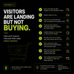


7/ Note: this is an independent CRO concept, not an official Saucerer redesign. The rating, delivery, returns and bundle are my own mock ideas, untested.
Food brand founders: which of the 3 stages is your page weakest at?
1
6/ And for everyone:
8. Cleaner ingredients and allergen sections, so nothing slows them down
Same page, same product. Built for the people who are actually on it.
1
3
5/ Most aware (ready to buy):
1. Free delivery in the top bar
5. A bundle of 3 with a clear saving
1
4
4/ Product aware (know the brand, not sure yet):
3. Star rating next to the price
6. Answers by the button: "Just stir into hot pasta"
7. Delivery and returns in one small box
1
5
3/ Solution aware (comparing options):
2. One line on why this sauce is different
4. Price per serving: about £1.63 a head
1
5
2/ Eugene Schwartz said buyers sit at different stages of awareness.
On a product page, most people are in the last three: Solution aware, Product aware, Most aware.
So the page has 3 jobs: show why this one, remove doubt, make buying easy.
1
1
16
1/ Most product pages talk to the wrong person.
Buyers on a product page are rarely strangers. They know jar sauce exists. Many know the brand. They're asking "should I buy this one, now?"
I redesigned the top of the Saucerer product page with that in mind. 8 changes. A thread

1
3
44
This is a concept project, still exploring.
If you used an app like this, what would keep you coming back: streaks, community, or rewards?
4
Habits come from challenges, not lectures.
Walk 5 km, see 1.08 kg CO₂ saved right away.
"Day 5 of 5. You did it!"
1
5
Tracking has to be fast, or people quit.
So the quick actions sit right on the home screen:
→ Add Activity
→ Scan Receipt
→ Log Trip
1
6
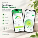
Home screen: one big number (150 kg CO₂), plus a comparison with the world and Bangladesh averages.
You see where you stand in one glance.
1
6
Small steps. Bigger impact.
I designed a concept app to make reducing your carbon footprint feel doable. 🧵

1
1
24
Note: This is an independent CRO redesign concept, not official work for Saucerer. The delivery, return and bundle details are proposed design suggestions, not verified company policies.
Which change would you test first on this product page?
A) Product messaging
B) Reviews and trust
C) Bundle pricing
D) Delivery and returns
1
Then I'd validate them with usability testing and controlled experiments where traffic allows.
These are hypotheses, not proven conversion lifts.
1
I'd start with the changes closest to the purchase decision:
1. Product value proposition
2. Reviews near the price
3. Clear delivery information
4. Bundle pricing
1
None of these changes requires a complete redesign.
They focus on three things:
→ Making value clearer
→ Building purchase confidence
→ Removing friction near the buying decision
Sometimes, the smallest changes are worth testing first.
1
8. Organize product details
Put ingredients, allergens and storage into simple expandable sections.
Less clutter. Easier scanning.
1