

Building a next-gen #DFMIS for transparent, IATI-compliant aid data. Track, validate & visualise development finance in one open platform.
Global
Joined October 2025
- Tweets79
- Following33
- Followers5
- Likes41


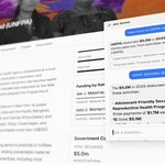



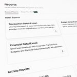

We can't predict every report format a ministry or donor will need. The new Report Builder in the Aether DFMIS uses a visual query builder so users can construct custom conditions, save the output, and share templates across their organization or publicly.
#aidtransparency #IATI @IATI_aid @DevCooperation @aidtransparency

Manually re-keying donor data into national systems is a major bottleneck. Aether's new import UI shows step-by-step progress - from initial XML fetch to field mapping - allowing you to pause, inspect, or verify before data goes live.
It bridges the gap between global reporting and national aid management.
#IATI @IATI_aid #GPEDC @aidtransparency @DevCooperation #aidtransparency


Development partners rarely spend funds in a straight line.
Aid predictability relies on understanding partner disbursement habits.
The new 'Spending Pace & Lumpiness' feature in the Aether DFMIS breaks down disbursements by quarter and project stage to show exactly when capital moves.
#IATI #GPEDC @IATI_aid @DevCooperation #aidtransparency @aidtransparency

Global climate flows topped $2 trillion this year, so tracking green capital is now a standard accounting requirement.
To make this straightforward, the Aether DFIMS now includes a Climate Finance tab to monitor allocations and measure impact, supporting open data principles from @IATI_aid, #GPEDC, @DevCooperation
Created with @ultramock


Aether's core DFMIS module translates messy transactional rows into macro-level clarity. The Headline Figures dashboard aggregates total budgets, planned disbursements, and transaction types over multi-year cycles to give a clear view of where aid is actually going.

Tracking multi-donor contributions can get messy. The Pooled Funds view aggregates trust fund activities, showing total contributions, disbursement balances, utilisation rates, and child activities alongside visual flow diagrams to map exactly which agencies are funding the pool.


Small change. Every destructive action taken within the Activity Editor now surfaces a toast notification with an Undo button, so you can reverse it instantly.
#AidTransparency #IATI


Activity Dates now all look consistent. Every date field shows a little calendar icon, so you can spot them at a glance. No more hunting for which field is a date. Tiny change, smoother flow.
#IATI #aidtransparency @IATI_aid

Added little (?) help icons throughout the Countries & Regions form. Hover any field and you'll get a plain-English explanation of what it means and why it matters. No need to guess what Vocabulary or Narrative means. Small change, big win for anyone new to IATI reporting.

Shipped 4 small fixes to the Humanitarian tab. Now a tooltip shows the response narrative. I renamed "Response Description" → "Response Activity Description", and added (?) help icons on all modal fields, and fixed Next-button misrouting so it lands on Countries & Regions.


