

Helping businesses build distinctive brands Brand Identity • Illustrations • Logos 📩 DM for collaborations
My portfolio
Joined November 2019
- Tweets6.1K
- Following822
- Followers1.1K
- Likes7.7K




Pinned Tweet
Brand identity for CAMPUS UNFILTERED - a podcast about university life.
The idea was to create something bold, youthful and expressive. Started with a few sketches, developed a CU monogram and extended the identity across podcast covers, social media designs and mockups 🎙️💜


Logo sketch and preview for SOPHY KICKS - a footwear store
After trying out different ideas, I explored how I could use a shoelace to form the initials “SK” while also giving a hint of the shoe’s sole 👟
The sketch. The logo.


A design can look really good and still not work.
If someone looks at it and has to figure out what it means, then something is missing.
Design is about making sure the MESSAGE is clear the moment someone sees it.
Just finished this app launch visual for Novaledger.
The idea was to keep it product-first: clear messaging, credible UI and a design that communicates trust.


Running late for the new week in our accountability group
But look what we have here
It's a new project for a web3 finance brand called NOVALEDGER.
Want the full brief join us today.
Visit: chat.whatsapp.com/FqVjzm1eNq…


Final submission for SAVORÈ
A design for a time-limited signature dish offer. The chef presenting the herb-roasted chicken naturally draws attention, while the colour, typography and layout stay consistent with the earlier designs.


Week 3 submission for SAVORÈ
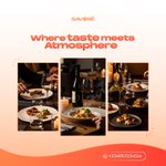
This design captures the dining atmosphere through warm lighting and intimate table scenes. Consistent typography, colour and layout maintain the established visual system while shifting the focus from a single dish to the overall dining experience.

Week 2 submission for SAVORÈ
This week was all about restraint and clarity, highlighting a single signature dish while staying true to the visual system from Week 1. Kept the layout clean, the hierarchy strong and let the food remain the hero.

Week 1 submission for SAVORÈ
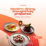
A premium restaurant focused on elevated everyday dining. Bold geometric type, appetite-led colour & clean space create clarity in fast-scroll feed. Each element lead the viewer from brand→message→reservation
“Modern dining, thoughtfully prepared”


This final design brings the journey together. Dark, ambient backgrounds and warm lighting remained consistent, keeping Lumo calm and premium.
What evolved was the storytelling from a product-led start in Week 1 to a human perspective. Light moved from being shown to being felt.

The last week for the Lumo brand
We've had our designers create designs for the brand for 3 weeks at the end let's see how good they were in brand consistency.
Join the accountability and gain access to a community that keeps you in check
Visit: chat.whatsapp.com/FqVjzm1eNq…


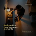
A quiet return home, keys dropped, shoes off, warm light wrapping the room.
An everyday moment made meaningful through comfort, calm and intention, the kind of feeling Lumo brings to life 🏠💡


This design continues Week 1’s dark, ambient setting, warm lighting and calm tone. A new serif subtext pairs with the sans-serif headline for balance, while subtle branding remains. Focus shifts from product intro to a human-centered moment.

The final design presents Lumo as a calm, premium smart-lighting solution focused on warmth and simplicity, using dark muted backgrounds paired with soft white and warm amber tones to enhance contrast and create a cozy atmosphere.
My submission for this week’s design brief 💡


what i consider my poster of the year, created with canva.
muse: @mavoswago

You’re unable to view this Post because this account owner limits who can view their Posts. Learn more
The brief was simple: a Christmas ad for a modern restaurant.
I focused on family, warm lights, shared meals and a calm, stress-free moment. The goal was emotion over promotion, positioning Noir Bites as a place where memories are made. 🎄✨

Are you ready to cook up something for the Christmas season?
Join our accountability community and participate with over 50 co designers
Join here 👇
chat.whatsapp.com/FqVjzm1eNq…


As we celebrate this season of joy and reflection, may the spirit of Christmas illuminate your hearts with peace, fill your homes with love and inspire hope for the year ahead.
Wishing you a truly Merry Christmas🎄🎅🏽 and a prosperous New Year 🌟

I designed this social media flyer for StayNest🏡 a short-stay brand built around comfort and a home-away-from-home experience.
Warm tones, lifestyle imagery and soft typography were used to create a calm, inviting feel, while a clear CTA ensure mobile-friendly clarity.


