

Software engineer @convertkit React, Html, Css, php, React Native - I talk about: Full stack development - Ui Engineer + Designer - Founder of @3dotmediaa
Joined February 2023
- Tweets6.9K
- Following7.4K
- Followers1.7K
- Likes12.8K





Pinned Tweet
CASE STUDY: How I helped my client brand YouGlam scale from struggling WordPress sales to €112,559 in just 30 days with a custom Shopify build, CRO-focused layout, and bundled offers
📈 Increased their conversion rate by 32% and AOV by 26% in under 30 days
/// A THREAD 🧵👇


comparison charts are the most wasted section on shopify product pages.
not because they don't work. because most brands build them backwards.
they start with "how do we look better than competitor x" and fill in rows until the checkmarks line up. the customer reads it in two seconds, clocks that you wrote it about yourself, and scrolls.
what actually works is starting from the objection.
what's the one thing stopping this person from buying. price, effort, trust, or "i already have something that sort of works." pick that, build the chart around it, and the rows write themselves.
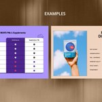
look at the two attached.
the first one isn't comparing brands at all. it's comparing against the entire pill category, and the rows are things people actually do. ends up half used in your drawer. 10+ bottles. you forget to take it. nobody argues with those because everyone's lived them.
the second one is better designed. cleaner type, better colour, nicer layout. but the rows are ingredient quality, transparency, feel, effect variety. every brand in that category claims all four. it looks like proof and functions as decoration.
that's the whole difference. one names a real behaviour, the other names a virtue.
specific rows that have moved numbers for me:
total cost over 6 months, not unit price
how many products this replaces
minutes per use
full ingredient list side by side
what the refund actually covers, in plain terms
two more things people get wrong.
placement. below the reviews section is where charts go to die. if the comparison is the reason someone converts, it needs to sit near the buy box.
and the opponent. it's often not a competitor brand. it's the customer's current routine, or the option of doing nothing at all. those are much harder to beat and much more worth addressing.
compare the decision, not the product.

1
2
239


i've built agent systems for clients this year and i use claude daily
so i'm not anti ai
BUT
i've stopped letting it write the first version of anything strategic
the audit, the offer, the section order on a pdp
i write that cold, badly, by hand
then i bring the model in to sharpen it
when i skip that step the output is fine. always fine. never sharp
fine doesn't convert
do the ugly first draft yourself
1
149


Hamza retweeted
The 6 Pillars of High-Converting Funnels (That Most Brands Overlook)
If you want to boost your sales without spending more on ads, you need to master these six stages of the funnel game:
1. Offers 🎯
Your offer is everything. Make it irresistible.
Here’s how to level it up:
Add valuable digital bonuses
Back it with a branded, bold guarantee
Show the exact transformation your product delivers
Set expectations: how long until they get results?
2. Landing Pages
Your landing page is your silent salesman optimize it relentlessly.
Test formats like:
Long-form sales pages
Quiz pages
VSLs
Listicles
Advertorials
The goal? Find what converts best, and scale it.
3. Upsells
Don't stop at the first sale.
Increase your AOV by offering smart, relevant upsells:
In-cart & post-purchase add-ons
Thank you page upsells
Email-based upsell flows
Make them logical, useful, and easy to say yes to.
4. Emails ✉️
The sale often happens after they leave the site.
Automate follow-ups with flows like:
Cart abandonment
Exit intent
Browse recovery
Review collection
Set up non-intrusive popups and capture leads without harming UX.
5. Optimization
Funnels aren't "set it and forget it."
Constantly A/B test to stay ahead:
Test your pages, copy, offers, and emails
Track the data
Implement the winners
Repeat it like a habit
Even top performers can be improved.
6. Referrals
Turn happy buyers into your best marketers.
Build a referral loop:
Automated email sequences
A compelling referral page
Simple software to manage it (like Snowball or ReferralCandy)
Let your customers do the selling for you.
This funnel setup helps you:
✔️ Maximize your current traffic
✔️ Reduce CAC
✔️ Increase LTV
✔️ Grow sustainably
Master these and your funnel won't just convert... it’ll compound.

Hamza retweeted
your content isn’t landing because you’re selling the ideal life
but your audience is stuck in survival mode
wrong focus
people don’t act on dreams
they act on discomfort
• struggling to pay rent (not becoming a millionaire)
• no leads this week (not scaling a 7-figure agency)
fix what’s hurting now
not what might matter someday
solve pain > sell vision
that’s what converts
Hamza retweeted
7 Cialdini backed persuasion hacks for high converting landing pages (with real % lifts):
Most landing pages look great but don’t convert here’s how to fix that using proven psychology:
Reciprocity
Offer something free (PDF, tool, trial) before asking for anything.
→ Free gift = +10–42% conversion lift
Liking
Use avatars that reflect your audience’s identity (age, style, tone).
→ Relatable design cuts bounce by 5–15%
Social Proof
Show off user count, testimonials, or live activity (“5 others viewing now”).
→ Increases sales by 13–20%
Authority
Logos of press mentions, certifications, or expert endorsements.
→ Adds 10–15% more trust + clickthroughs
Scarcity
Countdown timers, limited spots, or “only 3 left” messages.
→ Uplifts CVR by 15–25%
Consistency
Let users make a micro-commitment (quiz, poll, checkbox).
→ Boosts conversion by 8–12% through “I started, might as well finish”
Anchoring
Show a high priced plan first, then your standard one.
→ Makes the offer feel like a deal (+18–30% upgrade rate)
These aren’t just marketing tricks.
They’re human psychology backed by research + billions in test data.
If you’re designing a landing page and not using at least 3–4 of these, you’re leaving serious revenue on the table


On Why Most Sites Don’t Sell
Most websites don’t fail because of bad design.
They fail because they try to look good instead of make people feel something.
You can have perfect fonts, smooth animations, and zero conversions.
Because design without emotion is decoration.
Show people who they will become after buying not just what they’re buying.
That’s what makes them click “checkout.”
Your website isn’t just “a store.”
It’s your 24/7 sales team.
If it’s not converting, here’s why:
Weak first impression (design feels outdated)
No emotional hook (why should I care?)
Confusing product pages (too much text, not enough clarity)
No trust signals (reviews, guarantees, proof)
Fix these → watch conversions rise without more traffic.
Most wellness sites feel cold like buying from a pharmacy.
That’s why customers scroll but don’t connect.
A wellness brand should sell balance, calm, and lifestyle not just capsules.
People don’t buy vitamins. They buy energy, confidence, and a better version of themselves.
Want a site like this that actually converts? DM me.
