

Made by you. Not generated. by @diptanshuSays try it today : https://nitter.gq/t.co/UqDlfvKzoK
Bangalore, India
Joined April 2026
- Tweets2.3K
- Following284
- Followers276
- Likes3.5K





Pinned Tweet
Finally made the launch video for bitgrain.app :)
Try it today, and you maybe the lucky guy to get free pro, for a month!
3
14
930
grain goes on last. if you add film grain and then colour grade, the grade tints the grain too and it reads as noise instead of film.
grade first, grain on top, then stop touching it.
8
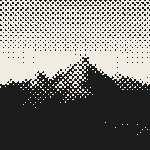
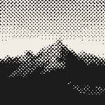
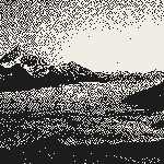
same peak, same 60 line screen. top is round dots, bottom is ellipse.
the ellipses chain into diagonal streaks along the ridge, almost like an engraving, but the snow patches lower down disappear into the black. round keeps them.
round or ellipse?

2
18
one bitgrain detail we care about more than it sounds: renders are deterministic. same photo, same settings, same dots every time.
so if your agent made a poster last month, it can make the matching one today and they'll actually match
1
1
11
small dither tip: push contrast and lift the shadows a bit before you dither a photo. error diffusion turns flat mid greys into static.
atkinson only passes on 3/4 of the error, which is why it blows out the highlights and gives you that old mac look
1
11
designers: one effect you'd ban from launch graphics for a year?
ours is the purple to blue gradient with a soft glow behind the product shot.
1
20
for posters made with ai tools: pick two colours before you start and refuse to add a third. most of what reads as the "ai look" to us is five colours fighting each other.
1
17
quick check before posting any dither: shrink it to thumbnail size. if you can still tell what the photo is, it'll survive the feed. a lot of ours turn to grey mush at that size on the first try, usually because the grid was too fine.
2
19
follow-up to the waterfall grit test from earlier. left: grit 0.8 at contrast 1.2. right: same grit, contrast pushed to 1.8.
ink coverage went from 23% back up to 33%. the dark leaves on both sides come back, and the water still stays rough and broken, which was the part we liked.
which one would you print?

1
36
same waterfall, same 44 line screen. the right one just has halftone grit turned up to 0.8.
we expected rough dot edges. we didn't expect it to eat this much ink. coverage went from about 62% to 22%, so the photo goes pale and only the darkest leaves hold on.
next try is grit with the contrast pushed up to win the shadows back.

3
36
same boathouse, same 1-bit, cropped close. left is atkinson, right is floyd-steinberg.
atkinson throws away a quarter of the error, so the shadows go solid black and the roof jumps out. floyd keeps every grey and the whole slope turns into fabric.
which one would you print?

2
4
71
two inks beat full colour on most launch posters. with only two you have to decide what actually matters in the photo, and everything else falls into the paper. for anyone printing real riso, what ink pair do you keep going back to?
1
45
same mountain, same 64 lines, same ink. the only change is the grid: upright on the left, turned 45° on the right. the upright one reads as pixels, the turned one reads as print. which one would you hang on a wall?


9
281
halftone rule of thumb we keep coming back to: count dots across the long edge, not dpi. under ~60 it reads like a gig poster, 60 to 150 reads as print, past ~300 your eye stops seeing dots and it's just a photo again. pick the count for the viewing distance
2
56
same mountain, same 64 line screen, two dot shapes. round dots on the left still hold the snow patches in the dark slope. the line screen on the right drops most of that and turns the ridge into an engraving. i'd still print the line one


1
5
89
after a week of dithering the same landscapes: atkinson for big skies, the 4 colour game boy palette when the shape matters more than texture (it kept the spiral field), floyd steinberg only at half strength or it turns into static. what's your default?
4
99
three coffees, two dithers. atkinson on the left keeps the hands soft but the latte art fades into a faint ring. bayer 4x4 on the right keeps both leaves and puts a grid on everyone's knuckles. i'd print the bayer one, curious if anyone picks the other


1
9
183
mountains above a sea of clouds, run through the 4 colour game boy palette with an atkinson dither. the sky takes the lightest green and the clouds below break into dotted bands. looks like a level select screen

3
12
211
same mountains above the clouds, same atkinson dither. contrast 1.0 on the left, 1.4 on the right. the extra contrast pulls the snowy peaks out but swallows the hills at the bottom into one black shape. i'd still print the right one


2
73
