

Type design studio based in Tallinn, Estonia.
Tallinn, Estonia
Joined April 2024
- Tweets26
- Following46
- Followers3
- Likes28



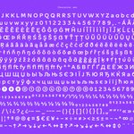


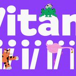
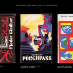


We’ve been featured on @itsnicethat ! A big thank you to Ellis Tree for the lovely write-up! ✏️❤️
Read here:
itsnicethat.com/articles/tup…

New font release! 🐣 Juunior is a sans-serif that pairs youthfully stretched curves with just enough discipline to behave in both display and text settings.
Take a peek here: typokompanii.com/fonts/juuni…


Tüpokompanii retweeted

Honored to be included in the list of foundries set to be popular in 2025 by @creativeboom 🤩
creativeboom.com/resources/2…

Tüpokompanii retweeted

Ladna #typeface by @typokompanii 👏
Ladna is a grotesque-style not too serious typeface equipped with a friendly presence through its slight quirks which it doesn’t bother hiding.
Explore more at > bit.ly/3zdS6xR
#type01 #typedesign #graphicdesign


Tüpokompanii retweeted
Introducing Vitamiin Variable 🎛️ by Estonian-based type foundry @typokompanii
Vitamiin is a versatile “Semi-Softie” typeface loaded with positive energy.
Test out and explore at > bit.ly/3MW6gXj
#type01 #typedesign #fontrelease #graphicdesigner #graphicdesign
Ladna in use, graphic design by Ott Kagovere

In anticipation of the publication of a new book in the Punk Research Series, Rab-Rab Press presents Agit-Punk – an exhibition about The Pop Group concert in Helsinki in 1980.
Helsinki Paja Gallery (Kalasataman Seripaja). 12 May–11 June: instagram.com/pajagalleria/

17
We recently found an episode of @proof_and_co’s Interrogang Podcast from 2022 where our fonts Ladna & Ladna Faux were mentioned. It was super humbling to hear the lovely comments (around the 08:15 mark) by Joshua and Kyle. Listen to the whole episode here: buzzsprout.com/1687654/13021…

20
OUT NOW: Vitamiin is a versatile “Semi-Softie” typeface loaded with positive energy. Stylistically, it’s a cross between a “Humorous Humanist” and “Giggly Geometric”, featuring an uncommon mixture of rounded and sharp elements.
typokompanii.com/fonts/vitam…

1
20
The font family is designed as a uniwidth system, meaning that each glyph shares the same metrics across all styles, causing no text reflow no matter the weight or slant angle being used.

1
18

Trafarett comes in three versions: Stencil, Frame, and Shadow; all with corresponding ZigZag Italics, in Thin and Thick weights – 12 styles in total, plus a variable font. All the styles share the same spacing to encourage intertwined usage.


1
15


FIRST RELEASE: Ladna is a relaxed grotesque typeface family that doesn’t take itself too seriously and isn’t bothered by its slightly amateuristic qualities. Yet it still took Andree Paat 9 years to complete, go figure 🤷.
typokompanii.com/fonts/ladna


1
18
The capital R and overall weight of the Heavy end of the font family was inspired by the landmark “Standard” sign in Tallinn. Photo by Tõnu Tunnel.

1
15
Next to Ladna we also offer Ladna Faux – the nihilist companion that is blissfully unaware of optical correctness. Both families come in a wide range of weights with corresponding italics, 18 styles in total, plus a variable font.
typokompanii.com/fonts/ladna…


12