

I design logos and brands. Worked with: Formula 1, Netflix, Dubai Govt, 2 Fortune 500 companies and 400+ small to mid-size businesses. https://nitter.gq/t.co/K6dTEaJY1T
Joined January 2021
- Tweets2.3K
- Following199
- Followers7.9K
- Likes6.3K


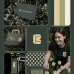


Logo design for a tech sales company called ‘Peak Line’. This company helps startups improve significantly by using advanced tech and data.
.
A simple, thoughtful, and sharp logo was required for this company.
1
6
627
Logo design process for a fruit farm called ‘Nifru’. This farm provides various kinds of fresh fruit to B2B and B2C brands.
.
A simple, fun, and thoughtful logo was required for this brand.
Logo design process for an organic apple farm called Savoridge. This farm produces high-quality, organic, pesticide-free apples and sell them to B2B and D2C brands.
.
A simple, feel-good, and clean logo was required for this brand.
Low paying clients will soon be a thing of the past.
AI gives them exactly what they wanted: fast, cheap, and good enough.
1
9
995


Logo design process for Windward Aviation Academy which prepares the next generation of pilots, and its identity needed to reflect the qualities every aviator develops in training: control, precision and confidence.
11
792
Logo design process for Kaya Botanica, a botanical garden. Watch the B turn into a stem, petals and a bloom.
Simply asked Opus 5.5 to explain the process behind my logo through motion graphics and it did this. I am excited and scared at the same time 👀
11
699
Logo design process for Solume a platform simplifies homeowners association management through structure and seamless connection. The logo reflects this with three interlinked forms, representing homes, systems, and community.
.
Built with geometric precision, it subtly forms an “S” while evoking clarity, flow, and shared responsibility, exactly what Solume delivers.
Redrew that "k" more times than I'll ever admit. anyway here's mindkick, an AI that makes images, video, music and ideas.


1
7
586
Logo design process for a stationery brand called ‘Zanko Office Supplies’ a company that designs and manufactures premium quality stationery products.
.
A clean, thoughtful and soft logo was required for this company.
7
757
In 2023, I designed the logo for the Detroit Grand Prix, a Formula 1 event.
.
Today, I’m sharing the process behind one of the rejected concepts.
.
The idea was to combine D, G, and P into a single mark, with horizontal cuts bringing in the speed and movement of racing.
.
The challenge was making three letters work together while keeping the form simple. Every adjustment to the curves, spacing, and proportions helped bring that balance closer.
.
It didn’t make the final cut, but I still wanted to give this direction its moment.
Brand design for ‘Kin’, a playful neighborhood dessert spot serving cookies, gelato, doughnuts & good times.
.
The identity is built around a bold, fluid wordmark, a warm yet vibrant colour palette, and a visual system designed to feel fun, social and full of personality.
8
453


Logo design process for ‘Runup’ a cricket academy built around preparation, pace, and the drive to keep improving.
.
The logo turns the letter R into a compact symbol of the sport: a cricket ball revealed through negative space, with parallel lines suggesting the momentum of a run-up.
.
A bold, energetic identity designed to feel as focused as the athletes it represents.