






Pinned Tweet
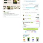
Thursday audit: the biggest change on Burst Creatine Gummies wasn’t visual polish. It was changing the job of the page.
Before: a product page.
After: a routine decision path.
The optimized flow does four things earlier:
1. Names the friction: “Real Creatine. No scoop required.”
2. Moves proof closer to doubt: testing, transparency, reviews, and the 30-day guarantee.
3. Makes the offer explain itself: pouches, servings, savings, shipping, and subscription value in one place.
4. Shows the daily habit, not only the SKU.
The strongest transformation is the sequence:
friction → proof → routine → offer
That gives the click a clearer reason to continue and gives the buyer less work after the click.
I’m validating the hypothesis against CTR, landing-page CVR, subscription starts, and renewals. No invented lift. The design is the hypothesis. The numbers are the verdict.
What is the first friction your product page should remove?
#DTC #Shopify #CRO

Your only competition is You yesterday.
So,
Get Serious
Get Better
Get Going
Never Stop
Good Morning, and have a productive day today ❤️


Adebiyi Samuel | DTC Conversion Designer retweeted
Buy-box redesigns I’d make when low conversion is really an understanding problem.
Made this concept for Fugelyn.
The issue was not only that people were skipping the subscription.
They were struggling to understand:
- What happens after placement
- How long the protection lasts
- How many pouches they actually need
- Which bundle fits their RV setup
- Whether Subscribe & Save is worth choosing
- Whether it is safe around family and pets
- What happens when the storage period ends
So I did not treat the buy box like a price selector.
I treated it like a decision system.
The structure:
- Show the 90-day timeline before asking for the order
- Separate one-time purchase from Subscribe & Save
- Tie bundles to real use cases
- Make the per-unit tradeoff visible
- Explain what “full storage season” includes
- Show free gifts as part of the total order value
- Answer usage, safety, quantity, shipping, and returns questions below the CTA
The goal is not to make the subscription option louder.
It is to make the subscription feel like the logical plan for the buyer’s situation.
That is the hypothesis:
When buyers can see what to buy, why they need it, and what happens next, the buy box stops creating hesitation and starts resolving it.

Buy-box redesigns I’d make when low conversion is really an understanding problem.
Made this concept for Fugelyn.
The issue was not only that people were skipping the subscription.
They were struggling to understand:
- What happens after placement
- How long the protection lasts
- How many pouches they actually need
- Which bundle fits their RV setup
- Whether Subscribe & Save is worth choosing
- Whether it is safe around family and pets
- What happens when the storage period ends
So I did not treat the buy box like a price selector.
I treated it like a decision system.
The structure:
- Show the 90-day timeline before asking for the order
- Separate one-time purchase from Subscribe & Save
- Tie bundles to real use cases
- Make the per-unit tradeoff visible
- Explain what “full storage season” includes
- Show free gifts as part of the total order value
- Answer usage, safety, quantity, shipping, and returns questions below the CTA
The goal is not to make the subscription option louder.
It is to make the subscription feel like the logical plan for the buyer’s situation.
That is the hypothesis:
When buyers can see what to buy, why they need it, and what happens next, the buy box stops creating hesitation and starts resolving it.
Adebiyi Samuel | DTC Conversion Designer retweeted
Just Do it
Good morning, let’s do it again today 💪


Adebiyi Samuel | DTC Conversion Designer retweeted

A homepage that makes me picture my morning already has me interested 😂

Homepage redesigns you SHOULD be running in 2027 🌟
Made this concept for StepUp Coffee.
The original homepage was selling the product.
Coffee pods.
Coffee gear.
Coffee collections.
A catalogue of things to buy.
The optimized version sells the feeling of having a better morning.
The angle we took:
Your everyday coffee should be worth it.
The structure is intentionally simple:
- Announcement bar continues the promise: “Your next favourite cup starts with better coffee.”
- Hero shows someone actively making an espresso, not just looking at a coffee bag
- Headline: “Make Coffee Worth Your Morning”
- Subheadline: “Smooth caramel sweetness for your daily ritual”
- CTA: “BREW BETTER”
- Reassurance: “30-Day Money Back Guarantee”
- Chat button reframed from “Chat” to “Request Anything”
Same product.
Completely different job.
The old page says:
> Here is our coffee.
The new page says:
> Here is what your morning could feel like.
That distinction matters.
People rarely wake up wanting to buy “Peru coffee pods.”
They want:
- a cup they actually look forward to;
- something better than overpriced roadside coffee;
- a smoother daily ritual;
- a small moment that feels worth keeping.
So the product still appears.
But it no longer has to do all the selling by itself.
The image sells the experience.
The copy names the benefit.
The CTA gives the visitor a simple next step.
And the guarantee removes the final bit of hesitation.
This is why a homepage should not just answer:
> “What do you sell?”
It should answer:
> “Why should I want this in my life?”
Same store.
Same coffee.
Different perceived value.
Once you stop treating the homepage like a catalogue and start treating it like the next chapter of the ad…
That’s when the funnel starts to feel like one connected story.
Steal this.

Full Gist on the Instagram Carousel Static Ads for StepUp Coffee. ☕️

Educational Static Ad for StepUp Coffee ☕️
This is how we'd approach it.
Instead of another "premium coffee, rich taste" ad...
Start with a question coffee drinkers actually ask.
"Is espresso a specific type of coffee bean?"
Then answer it.
Espresso isn't a type of bean. It's a brewing method.
Show the espresso machine pulling a shot, keep the StepUp bag in the scene, and use simple on-screen copy to teach something useful.
The product becomes part of the explanation, not just another bag sitting in an ad.
A few angles I'd test here:
Common coffee misconceptions
Espresso vs. roast level
How grind size affects brewing
What makes single-origin coffee different
StepUp's flavor profile and origin
The idea is simple.
Teach first. Make the product relevant. Give people a reason to click.
Because not everyone scrolling Instagram is ready to buy coffee.
But someone who learns something useful, gets curious about the product, or finally understands a coffee term might be more willing to explore the brand.
And instead of sending everyone to a generic product page, connect the ad to a PDP that continues the education and helps them choose the right grind.
That's the difference between showing a product and building a reason to buy it.
#EcommerceCreative #DTCMarketing #MetaAds #CRO


Adebiyi Samuel | DTC Conversion Designer retweeted
Homepage redesigns you SHOULD be running in 2027 🌟
Made this concept for StepUp Coffee.
The original homepage was selling the product.
Coffee pods.
Coffee gear.
Coffee collections.
A catalogue of things to buy.
The optimized version sells the feeling of having a better morning.
The angle we took:
Your everyday coffee should be worth it.
The structure is intentionally simple:
- Announcement bar continues the promise: “Your next favourite cup starts with better coffee.”
- Hero shows someone actively making an espresso, not just looking at a coffee bag
- Headline: “Make Coffee Worth Your Morning”
- Subheadline: “Smooth caramel sweetness for your daily ritual”
- CTA: “BREW BETTER”
- Reassurance: “30-Day Money Back Guarantee”
- Chat button reframed from “Chat” to “Request Anything”
Same product.
Completely different job.
The old page says:
> Here is our coffee.
The new page says:
> Here is what your morning could feel like.
That distinction matters.
People rarely wake up wanting to buy “Peru coffee pods.”
They want:
- a cup they actually look forward to;
- something better than overpriced roadside coffee;
- a smoother daily ritual;
- a small moment that feels worth keeping.
So the product still appears.
But it no longer has to do all the selling by itself.
The image sells the experience.
The copy names the benefit.
The CTA gives the visitor a simple next step.
And the guarantee removes the final bit of hesitation.
This is why a homepage should not just answer:
> “What do you sell?”
It should answer:
> “Why should I want this in my life?”
Same store.
Same coffee.
Different perceived value.
Once you stop treating the homepage like a catalogue and start treating it like the next chapter of the ad…
That’s when the funnel starts to feel like one connected story.
Steal this.
Homepage redesigns you SHOULD be running in 2027 🌟
Made this concept for StepUp Coffee.
The original homepage was selling the product.
Coffee pods.
Coffee gear.
Coffee collections.
A catalogue of things to buy.
The optimized version sells the feeling of having a better morning.
The angle we took:
Your everyday coffee should be worth it.
The structure is intentionally simple:
- Announcement bar continues the promise: “Your next favourite cup starts with better coffee.”
- Hero shows someone actively making an espresso, not just looking at a coffee bag
- Headline: “Make Coffee Worth Your Morning”
- Subheadline: “Smooth caramel sweetness for your daily ritual”
- CTA: “BREW BETTER”
- Reassurance: “30-Day Money Back Guarantee”
- Chat button reframed from “Chat” to “Request Anything”
Same product.
Completely different job.
The old page says:
> Here is our coffee.
The new page says:
> Here is what your morning could feel like.
That distinction matters.
People rarely wake up wanting to buy “Peru coffee pods.”
They want:
- a cup they actually look forward to;
- something better than overpriced roadside coffee;
- a smoother daily ritual;
- a small moment that feels worth keeping.
So the product still appears.
But it no longer has to do all the selling by itself.
The image sells the experience.
The copy names the benefit.
The CTA gives the visitor a simple next step.
And the guarantee removes the final bit of hesitation.
This is why a homepage should not just answer:
> “What do you sell?”
It should answer:
> “Why should I want this in my life?”
Same store.
Same coffee.
Different perceived value.
Once you stop treating the homepage like a catalogue and start treating it like the next chapter of the ad…
That’s when the funnel starts to feel like one connected story.
Steal this.

Adebiyi Samuel | DTC Conversion Designer retweeted
Educational Static Ad for StepUp Coffee ☕️
This is how we'd approach it.
Instead of another "premium coffee, rich taste" ad...
Start with a question coffee drinkers actually ask.
"Is espresso a specific type of coffee bean?"
Then answer it.
Espresso isn't a type of bean. It's a brewing method.
Show the espresso machine pulling a shot, keep the StepUp bag in the scene, and use simple on-screen copy to teach something useful.
The product becomes part of the explanation, not just another bag sitting in an ad.
A few angles I'd test here:
Common coffee misconceptions
Espresso vs. roast level
How grind size affects brewing
What makes single-origin coffee different
StepUp's flavor profile and origin
The idea is simple.
Teach first. Make the product relevant. Give people a reason to click.
Because not everyone scrolling Instagram is ready to buy coffee.
But someone who learns something useful, gets curious about the product, or finally understands a coffee term might be more willing to explore the brand.
And instead of sending everyone to a generic product page, connect the ad to a PDP that continues the education and helps them choose the right grind.
That's the difference between showing a product and building a reason to buy it.
#EcommerceCreative #DTCMarketing #MetaAds #CRO
Educational Static Ad for StepUp Coffee ☕️
This is how we'd approach it.
Instead of another "premium coffee, rich taste" ad...
Start with a question coffee drinkers actually ask.
"Is espresso a specific type of coffee bean?"
Then answer it.
Espresso isn't a type of bean. It's a brewing method.
Show the espresso machine pulling a shot, keep the StepUp bag in the scene, and use simple on-screen copy to teach something useful.
The product becomes part of the explanation, not just another bag sitting in an ad.
A few angles I'd test here:
Common coffee misconceptions
Espresso vs. roast level
How grind size affects brewing
What makes single-origin coffee different
StepUp's flavor profile and origin
The idea is simple.
Teach first. Make the product relevant. Give people a reason to click.
Because not everyone scrolling Instagram is ready to buy coffee.
But someone who learns something useful, gets curious about the product, or finally understands a coffee term might be more willing to explore the brand.
And instead of sending everyone to a generic product page, connect the ad to a PDP that continues the education and helps them choose the right grind.
That's the difference between showing a product and building a reason to buy it.
#EcommerceCreative #DTCMarketing #MetaAds #CRO

